Using data visualization to turn complex strategy into intuitive simplicity
By Rick Tinney
Humans learn and remember most easily when we receive content in a simple, immediately understandable visual format. Cave paintings, bathroom signage, and phone interface icons are just a few examples among thousands of visual icons that are intuitive and, therefore, easy to remember. After learning what they mean just once, we can apply our understanding of the symbols to future experiences. But that insight about the human mind is more than a scientific fun fact: it’s the key to distilling complex but important concepts—like enterprise strategies—into easily understood and memorable images.

When business leaders leverage that natural visual comprehension skill to communicate strategy across an organization, the result is greater clarity among all internal stakeholders and, as a result, more successful strategy implementation. Simply put, visuals communicate strategy more effectively than text or speech.
Taking a strategic initiative from page to production is a multi-step process rife with complexity and opportunities for costly misunderstandings. Rendering strategy as a visual helps all stakeholders understand even complex ideas at a glance. For this reason, visual design is one of the most important steps a business can take to ensure that its ventures are unified, understandable, efficient and, most importantly, successful.
Common Strategy Visualizations
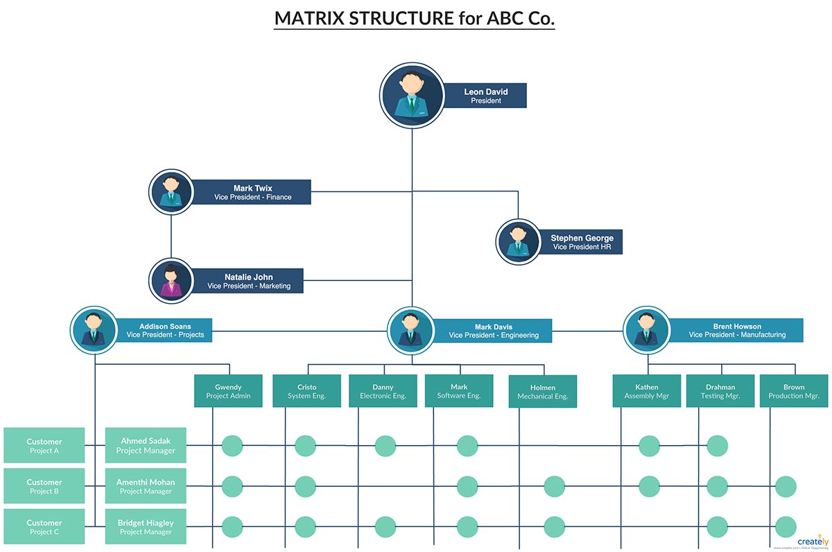
Communicating Hierarchy with Org Charts
An organizational chart is a common business visualization tool with a long history of improving business processes. The org chart is a simple graphic that depicts a company’s leadership roles and their reporting relationships, capturing the entire structure and hierarchy of an organization. This is a basic but powerful tool, particularly following a re-organization or a merger or acquisition.
By displaying a clear staff hierarchy, an org chart provides employees at every level with a simple illustration of their place in the chain of command, as well as a clear understanding of their role or their department’s or unit’s.
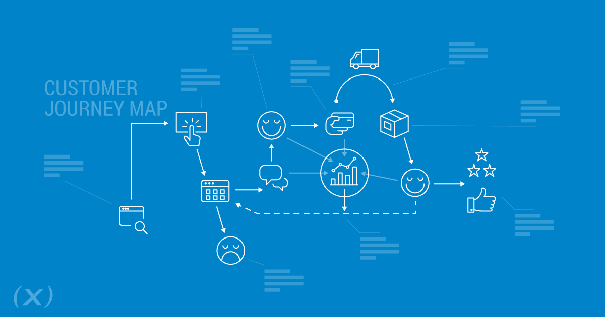
Improving Online and IRL Processes with Customer Journey Maps
A Customer Journey Map is a more advanced visual strategy tool that allows businesses to step into their customer’s shoes, which assists them in improving customer service and support or increasing conversions and repeat purchase.
By exploring and documenting the emotional needs and physical experiences of your patrons, patients or donors at every step in the marketing funnel, Customer Journey Mapping equips your organization’s leaders to make better operational decisions and craft marketing messages that will resonate with customers. It also provides insights into the drivers and obstacles that impact your Net Promotor Scores.
Visualizing the customer journey is a simple yet powerful way to analyze where you can improve your processes and to imagine new ways to interact with customers to maximize engagement and keep more people on the path to the next step. Winning one step at a time will result in increased ROI at the end of the road.
Branding a Major Corporate Strategy or Initiative
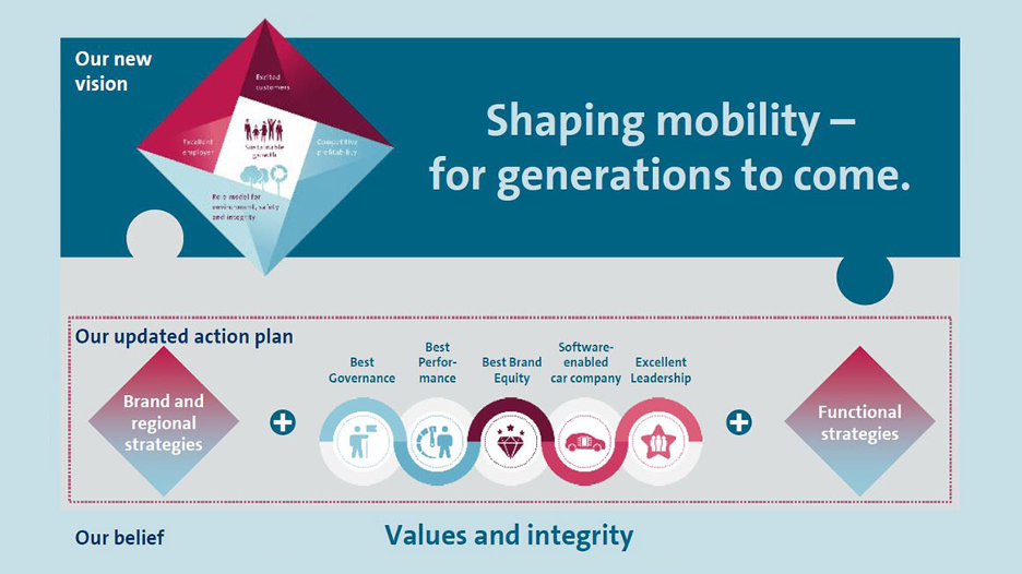
Volkswagen has launched a Together 2025+ strategy across its enterprise and led by its CEO, Dr. Herbert Diess.
The strategy includes an accompanying visualization featuring the four dimensions that Volkswagen wants its people to focus on as it tackles the future (and, unsaid, here, would be how this strategy helps to move VW away from its past including the U.S. emissions scandal):
“Excited customers; competitive profitability; role model for environment, safety and integrity; and excellent employer.”
At the center of the graphic is “sustainable growth” with an image of a family, trees and a process indicating continuity to reflect the company’s new stated goal: “to make mobility sustainable for us and for future generations.”
Volkswagen has also adopted and embraced a compliance initiative: Together4Integrity, or T4I for short. The company uses a visual to communicate strategy in this instance too. It has branded the initiative with an image of growth and many plus added a tagline, “We Keep Our Word.” An explainer video uses animated visualizations to show how the strategy work, paired with a rocking sound track.
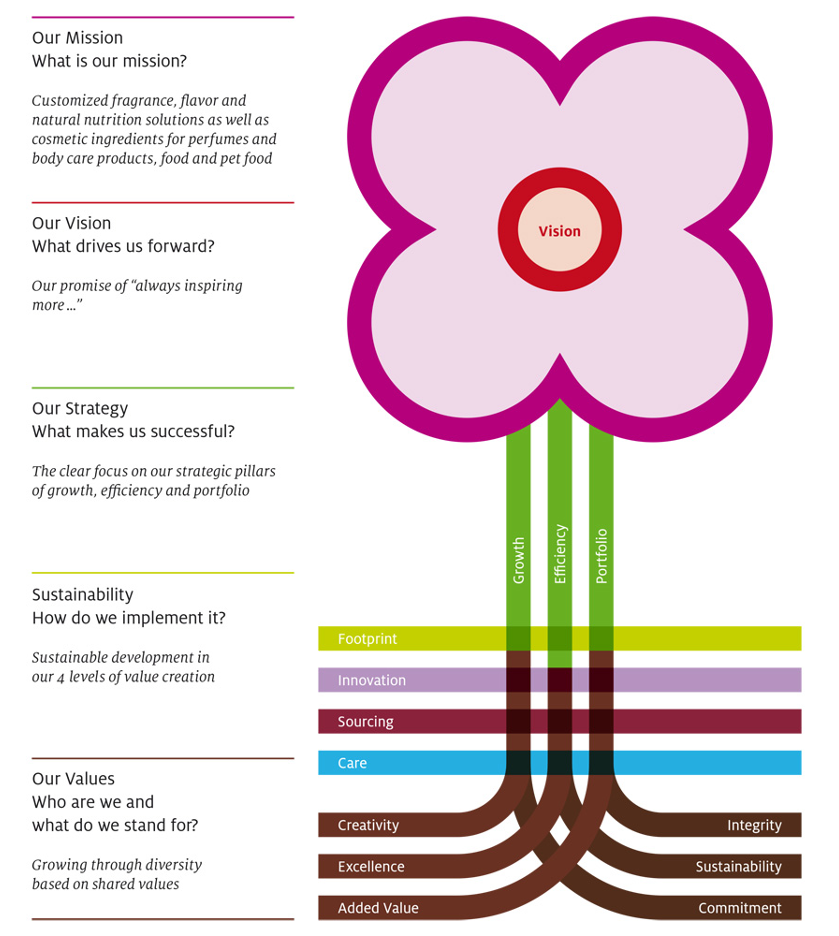
Symrise AG, a major European producer of flavors and fragrances with sales of over €3 billion, uses a visualization to share and reinforce its corporate strategy. Its forward-looking vision is the flower, supported by a stem made of three strategic pillars – growth, efficiency and portfolio – that are fed by a focus on sustainability and the company’s values. The graphic is part of the company’s customer-facing and employer brand and reproduced on its website, in its annual reports, and brought to life in a video as well as company events and employee experiences.
Data Visuals Communicate Strategy Through Visual Storytelling
Good strategy is data-driven, and in the hands of a visual strategist, that data can become a powerful visualization that helps support and sell the strategy.
This is important because, where a strategy pivot is concerned, resistance to change can interfere with the success of the pivot. Or, when a change is cultural or sensitive, and people are struggling to understand the need to change their behaviors, presenting the data that drove the change can provide the justification and motivation they need (among other thoughtful communication vehicles to support them through the change). Lastly, a well-constructed visualization can communicate information at glance that would otherwise take hours to read through and understand.
Software company Tableau creates visualizations from data and shared its best and most beautiful data visualizations to give people motivation to think outside of the box and share datasets in creative and more engaging ways. One example they shared was the Obama White House’s interactive treemap visualization of the federal budget:
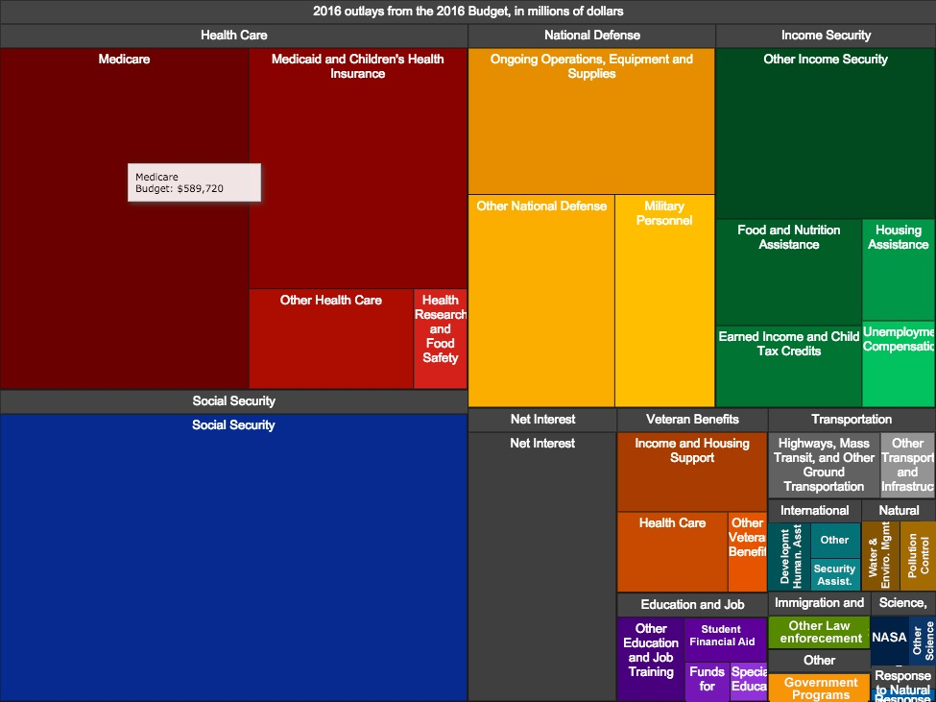
While not quite as dynamic and ambitious as the New York Times’ 2013 federal budget visualizations, it was a lot faster to navigate than a 200 page PDF.
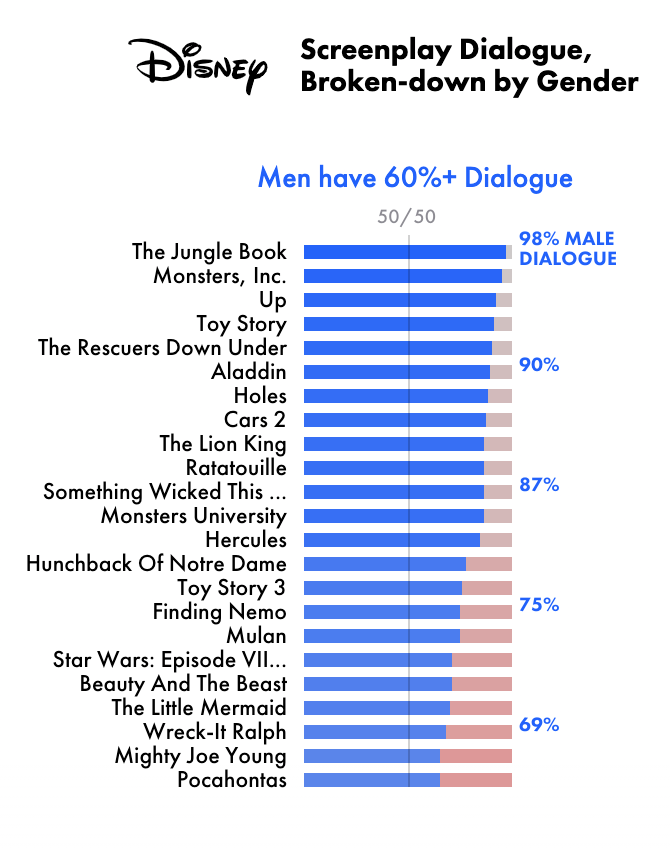
While the following example is pulled from a media outlet’s data visualization and not a corporate example, The Pudding, a media outlet dedicated to visual essays, compiled an extensive set of screenplay dialog data documenting the speaking roles between male and female characters in Disney movies. The data revealed that female characters get far less airtime than males, even in princess movies starring female lead characters.
Strategy Visualizations Get Visible Results
If you’ve ever sat through a long PowerPoint presentation full of bulleted lists and numbers, you know from experience that strong visuals are more compelling than words. Researchers at the University of California San Diego have found that emotional images have a more immediate measurable effect on behavior than emotional words. And scientists have long known that images are more memorable than words (it’s called the picture superiority effect).
So, when it comes to important enterprise strategies or strategic initiatives, if your goal is to ensure employees have a clear understanding of your business strategy, use visuals to communicate it.
(X) has the expertise needed to communicate and execute your strategic initiatives. Contact us to discuss how we can bring your strategy to life with a visualization and boost your company’s internal operations and external successes.